
How big does a QR code need to be? The 10:1 rule, and where we stopped trusting it
Ten to one is the rule everybody repeats. It is a good starting point and a bad finishing point, and the gap between the two is what decides whether anyone actually scans your sign.
Here is the short answer, and then the honest version. A QR code is readable from roughly ten times its own width. A 60 mm code is good for about 600 mm, which is arm's length across a counter. A 250 mm code is good for about two and a half metres, which is the width of an exhibition aisle. If you take nothing else from this, take that ratio and stop putting postage stamps in the corner of two-metre banners.
The longer answer is that ten to one is a rule of thumb, not a measurement, and we treat it as a starting number rather than a finished job. Of the fourteen sizes we hold, exactly one has been printed and scanned in the real world. The rest are designed to the rule and carry no proof, and we would rather write that down here than let you find out on a delivery pallet.
The rule, and what it is actually doing
A camera has to resolve the individual squares in the code, not the code as a whole. Those squares are called modules. The more data you put in, the more modules you need, and at a fixed physical width more modules means each one is smaller and the readable distance drops. Ten to one bundles all of that into a number a designer can use without a light meter.
So the first question is never how big the code should be. It is how far away the person is standing. Work backwards from there:
- A counter stand on a till - somebody is about 600 mm away, so the code wants to be around 60 mm.
- An A2 board on an easel - somebody reads it from about 1.25 m, so around 126 mm.
- An A1 board on a wall - about 1.8 m, so around 178 mm.
- A roll-up banner at a show - people scan it from across the aisle, roughly 2.5 m, so around 250 mm.
- A0, the big one - about 2.5 m again, so around 252 mm.
Those are the numbers we use, and you can see them on the printed range and in the design studio. They are not rounded for comfort. A 250 mm code on an 850 mm banner really is a quarter of the width of the thing, and it looks like far too much until you go and stand where your customer will be standing.
Where we stopped trusting it
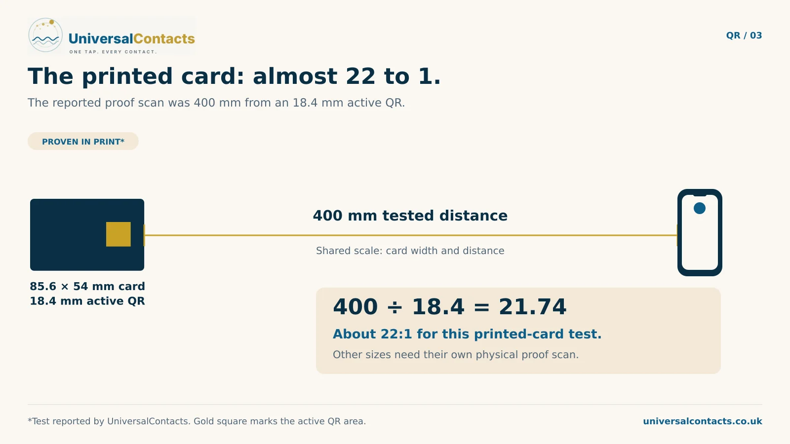
One size in our table has been printed on real stock and scanned off it with a real phone: the 85.6 x 54 mm business card, with an 18.4 mm code, read at 400 mm.
Do the arithmetic on that and it is not ten to one. It is closer to twenty-two to one - the code is less than half the size the rule would have given it, and it still reads at arm's length. That is what a card has going for it: it is held in the hand, in whatever light the room has, usually flat, and it uses a lower error-correction level that keeps the modules large.
None of those advantages survive the trip to a banner. So every size above a card in our table is set at ten to one - deliberately conservative, because the failure mode is somebody standing in front of your sign looking like they cannot work a phone.
We have scanned one of our fourteen sizes off a real print. The other thirteen are designed to the rule and have not been scan-tested. That is why our product pages say a code is made to read from a distance rather than tested to.
We would rather publish that sentence than the version that sells better. A page you can correct is a small problem. A customer holding a two-metre banner that does not scan is a different one.
Why a banner is not a big card
The temptation with any of this is to design the card and scale it up. It does not work, and the reason is that the two objects are read from different distances by people in different moods.
- Type has a floor too. Text that reads perfectly at 2.1 mm on a card held in the hand is invisible from three metres. Every size needs its own minimum type size, not a percentage of the last one.
- A card gets a second chance and a banner does not. If a card does not scan, the person is standing next to you and you can hand them your phone. Nobody walks back across an exhibition hall to try again.
- The card can tap. Our cards carry a chip as well as a code, so there are two ways in. On printed signage and banners there is no chip at all - the code is not a detail on the artwork, it is the function of the artwork.
That last point is worth sitting with if you are briefing a designer. On a banner, the code is not decoration to be tucked away tastefully. It is the reason the banner exists.
Error correction is a trade, not a setting
QR codes carry redundancy so they still read when damaged. There are four levels - L, M, Q and H - recovering roughly 7, 15, 25 and 30 per cent of a damaged code.
It is tempting to set everything to H and feel safe. It is not free. H adds modules, and at a fixed physical width every module gets smaller, which costs you scan distance. On a card at 18.4 mm that trade really bites, which is why our cards use M.
On a 250 mm banner code the modules are enormous either way, so the damage tolerance costs nothing worth having. And a banner is precisely the object that gets rolled into a case, unrolled at ten events, scuffed at the edges and rained on in a car park. Everything we print large uses H for that reason.
The quiet zone is part of the code
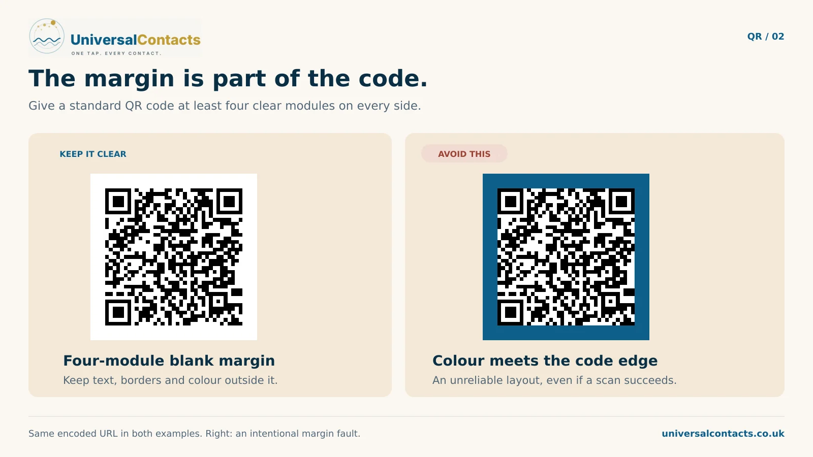
The blank margin around a QR is not whitespace a designer can reclaim. It is how the camera finds the edges. We hold it at a tenth of the code width on everything we print large. That is 25 mm of clear space around a 250 mm banner code. A card gets a little more than a tenth: 18.4 mm of code carries a 2.2 mm margin, because it is the smallest code we make and has the least room to lose.
This is the single most common way a beautiful piece of artwork stops working: somebody tucks the code neatly into a corner, or runs a coloured panel right up to it, and takes the margin away. If you are reviewing a proof, check the margin before you check anything else.
What actually stops a code scanning
Size is the one everybody asks about and it is rarely the thing that fails. In practice it is one of these:
- Not enough contrast. Dark code on a light ground. A mid-grey code on a coloured panel might look considered and scan badly. Inverted codes - light on dark - are a coin toss across phone cameras.
- Gloss laminate under a spotlight. A shiny finish on a sign lit from the front bounces the light straight back into the camera. Matt costs the same and does not do that.
- Curve. Vinyl that has been rolled wants to stay rolled, and a code across a curve reads worse than one on a flat panel. Keep it away from the roll on a banner.
- Height. A code at ankle level on a pull-up banner gets photographed by nobody. Put it where a phone is - roughly chest to eye height.
- Distance you did not plan for. A board behind a counter is not read from where you are standing when you approve the proof. It is read from where the customer queues.
Before you send artwork to a printer
Five things, in the order they go wrong:
- Decide the reading distance first, in millimetres, from where the person actually stands.
- Size the code at about a tenth of that, and do not let anybody shrink it for the layout.
- Keep a clear margin of a tenth of the code width on all four sides.
- Ask for matt rather than gloss on anything that will be lit.
- Print one at full size on a home printer, stick it on a wall, and walk backwards. It costs nothing and it is the only test that counts.
That last one is not a joke - it is exactly how we proved the card, and it is why we will not claim the other sizes until we have done the same for each of them.
The part most of this is really about
There is one more question that does not come up until later, and it costs more than any of the above: what happens to the code when the details behind it change.
A printer will print whatever code you send them, beautifully, and for less than we charge. Ask what happens to it when you move premises or change your number. A card in a drawer is a small problem. Eight signs on a building are a different one - and a code that points at a page you control, rather than straight at a phone number, is the difference between editing a page and reprinting a building. That is how the code side works here, and it applies to every printed item we make, from a counter stand to a paper card.